Colour
If you were a colour, what colour would you be?
As a child I loved being asked If you were a colour, what colour would you be? This is also a perfectly valid question to ask any adult as colours contain physical and spiritual energies that have real effects on our bodies and nervous systems. We know instinctively that yellow is uplifting while black can be depressing and it is in our language too, a person is suffering from the black dog or feeling blue while angry people see red.
Colour is light and light waves penetrate our energetic system. Every cell in our body is light sensitive and gives off its own light vibrations – the auras which surround our bodies. According to ancient Indian Ayurvedic medicine we have seven energy centres in our body known as chakras. Each chakra has its own colour with the crown chakra acting as a prism through which vital white energy passes. The light is then broken down into its component colours and sent to energise the individual chakras.
We are attracted to different colours at different stages of our lives. When we are born our parents know intuitively to dress us in soft hues to reflect our vulnerability; as teenagers we often go for strong passionate colours like red or self -protective colours like black. As we mature blues and greens can predominate while we often pump for the pastels again as we move into old age. Colours can also have strong cultural associations too, for example Westerners associate white with innocence and purity while in India white is the colour of death. In China black represents the yin or feminine force in the universe.
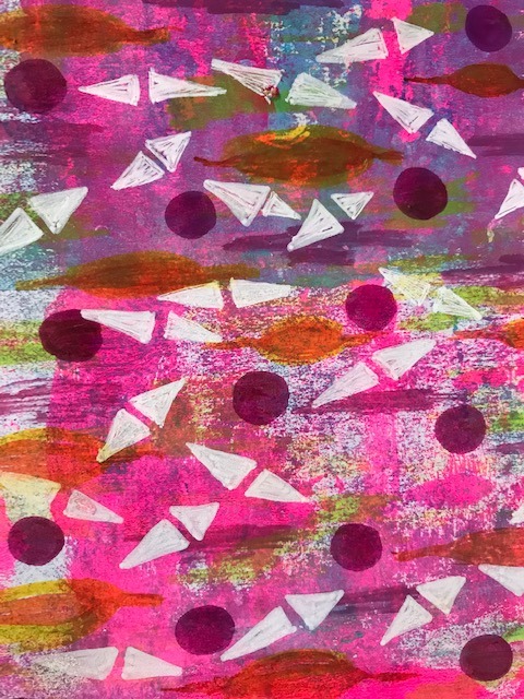
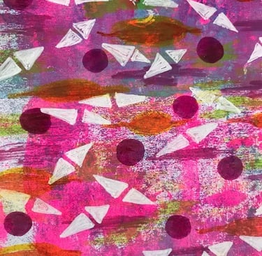
As an artist I don’t approach colour very scientifically. I know about complementary and contrasting colours, but I work intuitively constantly asking- what colour is needed in this spot right now? Sometimes the colour I choose works and sometimes it doesn’t. Often there is not enough contrast between light and dark or too many colours merging into each other but if I put my work somewhere I can look at it each day I can work out - eventually - what needs changing. I am attracted to certain colours mainly warm ones like pinks, yellows, gold and greens including turquoise. Turquoise is an interesting colour; like black it can be used for self-protection/confidence.
I feel I should be brave and use colours that I don’t like. I have tried, for example muddy browns, murky oranges and black and then painted over them. Too muddy, too murky, too black for me.
I do think though that experimenting with different colour mixes is a good idea. This really is a science. From the three main primary colours of red, green and blue you can get some beautiful hues. Many artists create their own swatches from these experiments. Such a good idea because many a time I have needed more of a mixed colour only to find I couldn’t get the same result when I tried again. Making a note of what colours you used (and how much) for the mix is strongly recommended.
This wee article has been a bit of a colour mix. But here are the primaries - understand that colours have healing properties, don’t be afraid of using colour and trust that the colours you use are true reflections of you and what you wish to give the world.